

The use of effective store signage and the optimal placement of that signage may just be one of the most overlooked aspects of running a small retail store. As a former small store owner, I cannot tell you how many times I was asked questions about things that I thought were clearly spelled out in various signs around our small store. Customers who refused to notice my signage about sales and even store hours often frustrated me. Here are a few things I wish I’d known about placing signage in a small retail store.
 First Impressions Count – Most people who enter a retail store will pause a second or two and quickly scan the space. They often look up for visual clues about which way to proceed as they look for the items they wish to purchase. Make sure the signage near your entrance/exit is placed in such a way that it can be seen clearly and quickly. Ensure that there are no columns, light fixtures, shelves, etc. blocking the navigation signage for your store. A customer who can’t quickly see which way they need to proceed will be frustrated and this may lead to other customer service problems later on.
Use Lighting to Your Advantage – No sign can be read without sufficient lighting, so make sure all of your signage is well lit. Use spotlights to highlight signs you especially want to be noticed. Make sure the lighting used around signage is at least twice the light level of the store’s ambient light level.
Be Clear, Concise & Consistent– All signage in your store should use as few words as possible while still being easy to decipher. Long, wordy signs will not be read, period. Cursive and swirly-looking fonts can also be hard to read. Pick a style and stick with it – use the same font style and colors for all of your signage. Also, using too much signage can be overwhelming to a customer, so don’t over-do it.
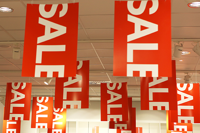
 Use Color Wisely – If you have a certain color that you use in your logo and other branding materials, use that color for most of your signage. A good example of that would be Target and the color red. Almost all signage in their stores is red, as well as their Target brand packaging and a lot of their interior décor. Colors can be used to convey a sense of urgency in shoppers by using red and yellow, a sense of calm can be conveyed by using green and blue, and using black can convey a sense of luxury.
Use Imagery to Balance it Out – Using only signage with words can be monotonous and boring to shoppers. Using imagery to convey an idea is widely used in the retail industry because most people readily respond to visual stimuli. Encourage shoppers to explore your stain department by hanging a sign over that area with a picture of a happy, smiling do-it-yourself-er staining a beautiful piece of furniture. That sign will convey several things to your customer – first, the stain you need is here, and second, if you use this stain, your project will be beautiful and that will make you happy!
Using signage to your advantage in a small retail store is something you may have overlooked or taken lightly in the past, but in this ever-increasing competitive retail world, it is definitely something you should not take lightly. Take a few minutes to walk around your store today and see if your signage lives up to the principles outlined above. Don’t be frustrated by your customers’ lack of attention to your signage – take action to fix it!


